
Post by leo on Sept 25, 2019 2:27:26 GMT
I just got the Carl Barks library vol 21 from FG and when I was looking through the pages it hit me: the artwork looks radically different from that from earlier books.
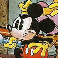
I'm reading through his works for the first time with this collection and am currently reading volume 8, so I immediately noticed how different everything looks on vol 21 compares to what I'm reading. The adults look rounder and shorter, their eyes look more googly, and HDL on the contrary look taller and a bit slender, and their facial expressions changed a lot too, they are simpler and way less "cute" now. Overall, I noticed in early volumes Barks was emulating perfectly how the characters look on the Disney cartoons, but then he apparently started caring less about fidelity and developing his own particular style. Oh, and of course the lettering changed too, but I guess that was to make it more readable for kids.
Now, I'm not saying the art looks bad at all, but I vastly prefer his early drawings (around 46-48, which is what I have read anyway). They look way more detailed, more delicate, it seems he used to put a lot more effort into them. HDL particularly used to look gorgeous, they body language and facial expressions were so cute and endearing, it really made you love the little guys. It made me a bit sad, knowing that moving forward with the books I'm not gonna see the same kind of art I've grown to admire.
Is this change in artsyle a known and discussed thing? Cause I've never seen anyone talking about it before. Maybe when people talk about the "peak period" they are also referring to a decline on art quality? What do you guys think, do you prefer the early, more Disney like drawings, or the later Barks' own version of the characters?

