Those kind of rewrites originated in the 1940s, when Europeans were a bit queasy about Americanization and didn't really want their kids exposed to too much American "propaganda". Disney in general had this "way too American" stigma at the time, so localizing the translations like that made it at least come across that this may be "mass-produced American garbage", but it's at least being edited by locals that care about your kids.
In the 1940s, that's understandable. But I grew up in the early nineties, and it was still like that.
Because of tradition! What would older Duck fans say if these translation details were revised after so many decades? Speaking as someone who grew up with the comics in Norwegian, it would be very strange to see Scrooge talk about the first coin he earned as an American "dime" in our local editions rather than a Norwegian "tiøring". Despite the fact that I of course knew it wasn't a "tiøring" originally.
In Brazillian translations, the currency is not US Dollars, not even the Brazillian Real. It's "Patacas", a fictitius money. So, I think it makes sense for brazillian readers that those patacas coins could be golden, or even of any color, because it doesn't exist in real life.
Oh, absolutely, it makes sense when the text specifies a fictitious currency. Isn't that the case in Germany, too? The "taler"? You can have all the gold coins you want in that case. And then there are all the countries where Duckburg is depicted at least some of the time as located in the country where the comics are published, and the symbol on the bin is the symbol of the local currency. Some of those countries might have more gold-colored coinage than the USA does. I'm just talking about the coloring I want to see in English-language printings.
The nice thing about "Taler" is that it used to be a currency in parts of the German speaking area, a long time ago. So it's not a fantasy word, but it's also nothing that's still in use. Bonus: It's etymologically related to "Dollar" (in fact, pretty much the same word).
Why do you think De Vita himself colored this comic?
Most Disney comics artists never color their work themselves.
It wasn't a comic, but an illustration for a reedition of the comic.
Because of the "painty" style, I doubt it was colored by someone else.
Or maybe I am wrong.
Then again, maybe these are the colors he had in mind for her all along and the older printings had colorings independent from his vision?
Ah, okay. Well, I still have no idea if he colored it himself. But I guess it's possible. Maybe the internet says something about whether De Vita usually colors painterly covers like this personally.
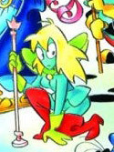
It's ironic how her color palette here looks more like what the Prince of Fogs is supposed to be... who is here almost all blue, like he was in the third "Sword of Ice" episode. (he even has the flail he temporarily wields against Goofy in this story) Though even without the colors, she looks a bit different, design-wise. She is now distinctly wearing gloves, lacks eyelashes and her scepter has a different tip. I don't hate it, per se... it could grow on me...
--- Gaucelm de Villaret gaucelm@gmail.com --- gaucelm.blogspot.fr twitter.com/GothHelm --- facebook.com/gaucelm
Responding to this message of Ramapith he posted on the Rosa facebook group:
"I love the soft gradients in the Fantagraphics DRL that you and I labored over—in part because they help *avoid* flatter, brighter ("traditional Whitman/European") colors that would sometimes distract from the action."
You make it sound like it's EITHER gradients OR flat but bright colors. How about flat and muted colors? The background gradients in the Don Rosa Library are both unnecessary and ugly in my opinion.
Responding to this message of Ramapith he posted on the Rosa facebook group:
Caballero, quite a few of us—including not just Rosa, but Carl Barks—agreed in the 1990s that background gradients, when handled properly, could add atmosphere, class, and sensitivity that we'd never seen flat colors accomplish prior to that.
Yes, it is possible to have flat and muted colors that look good and even beautiful, and/or add elegant atmosphere; some stories succeed in this. In just the same way, it's also possible to use gradients in a way that even I dislike—for instance, adding too many, so everything seems overtextured and mushy. But a happy medium is absolutely possible.
A team of talented colorists and I worked hard to tweak the gradients in the DRL exactly to Don's satisfaction. Your personal tastes are different. I can't help that.
Caballero, over the years, you've tried to praise the things my team and I have done that you liked—but you've also raged to the point of implying we should be fired (to be fair, not recently) for doing things you disliked, from aspects of coloring to aspects of translations/localizations.
Did you know, Caballero, that the main reason you saw the work of your own favorite, William Van Horn, in the IDW comics was because I was there to plump for him? I'm not saying this to brag; I'm saying that someone can have different creative tastes than you, still have a net positive effect, and still help you in ways you don't even realize.
At long last, cut my team and me some slack—and be aware that we do what we do, that we struggle to stay in this difficult industry in the face of endless obstacles, because we care about our art form immensely.
Ramapith Although I prefer my comics completely gradient free (especially ones that are not modern, or have an old-fashioned feel such as Rosa's comics), I do believe that gradient coloring that has a purpose can be acceptable such as these: i.imgur.com/EnpdVxE.png Here they are used to enhance the lighting effect, to highlight the emotions of Scrooge or to make the plaque look more metallic.
On the other hand, the Don Rosa Library is full of completely unnecessary gradiets such as in the backgrounds of these panels: i.imgur.com/zhKytBF.png Here the gradients really serve no purpose, they only make the pages look gaudy, and most certainly do not add atmosphere or class to the pages.
Post by Scrooge MacDuck on Feb 27, 2023 22:15:52 GMT
Funny enough, I'm more ready to accept gradients in a blank background than on characters/objects, by and large, so a number of the ones Caballero deems most unnecessary jar with me much *less* than some of the one he finds fitting… That being said, I've increasingly found that my occasional distaste has less to do with gradients *qua* gradient, and more with a sort of overly smooth, "technological", digital look. Though I wouldn't want'em all that way, I've generally enjoyed stories with hand-painted, cel-animation-like backgrounds. I'll freely admit that it's quite an irrational thing, and nor would I want thereby to imply that I *actually* think a digital colorist's work is easier/less respectable (if only because I've found myself doing a fair bit of digital coloring of my own in recent years!).
In any case, all that is personal taste, and bouncing off of what Ramapith said, I will certainly say that if Rosa likes gradients, I am very glad that the DRL has'em. (Likewise I deeply cannot abide Rosa's preference for Scrooge's collar and cuffs to be moleskin-gray, as I've mentioned a number of times before on this forum, but wouldn't have them any other way in a definitive, authorial edition like a Rosa Library.)
Post by blondegooseduck on Mar 1, 2023 14:18:31 GMT
Personally i think that gradients can be great too, especially if there isn't much shading on the characters themselves, gradients can add a lot to a scene that would otherwise be just flat colours and black lines. But of course there are some colour combinations in gradients that will look so-so. It's not an easy thing to do.