I wasn't involved with this particular story—but this page looked this way in Another Rainbow's Carl Barks Library and Carl Barks Library in Color, too.
Hamilton was unable to get a proof for this page in the 1980s, so (awkwardly) reinked it. The Fanta books' default is to reuse the Hamilton versions, so here that's what happened.
I'd meant to inform my Fanta colleagues, but accidentally didn't. I'll obviously talk to them before they do a second printing. (I'm not the Barks editor, but I do help them sometimes; for instance, I caught this book's title story "Balloonatics," which had a traced page that we replaced with the true Barks version.)
Do you know who did the reinking? And which stories were involved? If this were published on Inducks, there might more awareness in the future, as there has been for the Dutch reinkings of Race to the South Seas and Darkest Africa.
I took David's post to mean that Hamilton reinked it himself.
I took David's post to mean that Hamilton reinked it himself.
That wasn't my intent. Reinkers at the Hamilton company could be one of several staffers, and I'm not sure who did it in this case.
Some partially, or entirely reinked material originating in the Hamilton CBL includes:
- W CP 1-01 Letter to Santa (page 1 only)
- W KGA 2-01 Donald Duck Tells About Kites (at least part of all pages)
- W WDC 87-02 The Terrible Turkey (pages 3, 5, 6 only; Inducks says reinked by Jippes but it's actually a non-Jippes reink) Fantagraphics version substitutes a Dutch line art source that I accessed and believed was original, though it could possibly be a Barks/Jippes combination. (It's good enough that I'm actually unsure.)
- W WDC 240-01 The Fraidy Falcon (page 3 only)
- W WDC 242-01 Balloonatics (page 7 only) Fixed at Fantagraphics
"Too Many Pets" and "The Hard Loser" were both reproduced—in whole or in part—from color sources in the CBL, and had some retouching done to get rid of the color; but the majority of the linework does appear to be Barks' own. I believe (though I'm not 100% sure!) that every post-1983 printing of these two stories was made from the CBL version.
W WDC 87-02 The Terrible Turkey (pages 3, 5, 6 only; Inducks says reinked by Jippes but it's actually a non-Jippes reink) Fantagraphics version substitutes a Dutch line art source that I accessed and believed was original, though it could possibly be a Barks/Jippes combination. (It's good enough that I'm actually unsure.)
Any chance Jippes himself might remember if he reinked parts of it?
extreme examples of the gradient coloring were compared with coloring from the 50s and accompanied by text arguing: "Look how much more moody and effective this simpler coloring from the old days is". The campaign spread around the web, and eventually Kim Thompson and Fantagraphics picked up on it.
I do agree with them, I think the original coloring from the 1950s does look better than super shiny modern gradient coloring, I just happen to believe flat coloring without the silliness (pink walls in the money bin, green rocks, etc.) would look even better. And I'm sure most of those European fans would agree.
I recently had the chance to read Volume 1 of the Scandinavian Carl Barks Collection, released when the series started in 2005. In that early phase of the Scandinavian Library, I can certainly agree to an extent that the gradients in Susan Daigle-Leach's coloring were pushed too far. What I specifically found myself reacting to was characters' clothes being rendered with gradient colors in a number of panels... that just felt like going too far.
From what I understand, though, readers' response to the coloring led to Egmont dialing back on the use of gradients after the first few batches of books. Gradients were still used, but to a lesser extent than before, so I think the coloring in later books is more normal (or neutral) in this regard.
I also have a few of the Carl Barks Library in Color albums from the 90s, and generally speaking I'm really happy with Daigle-Leach's coloring in there. The albums are also printed on matte paper rather than the glossy stock used in the Scandinavian books, which I think makes a difference.
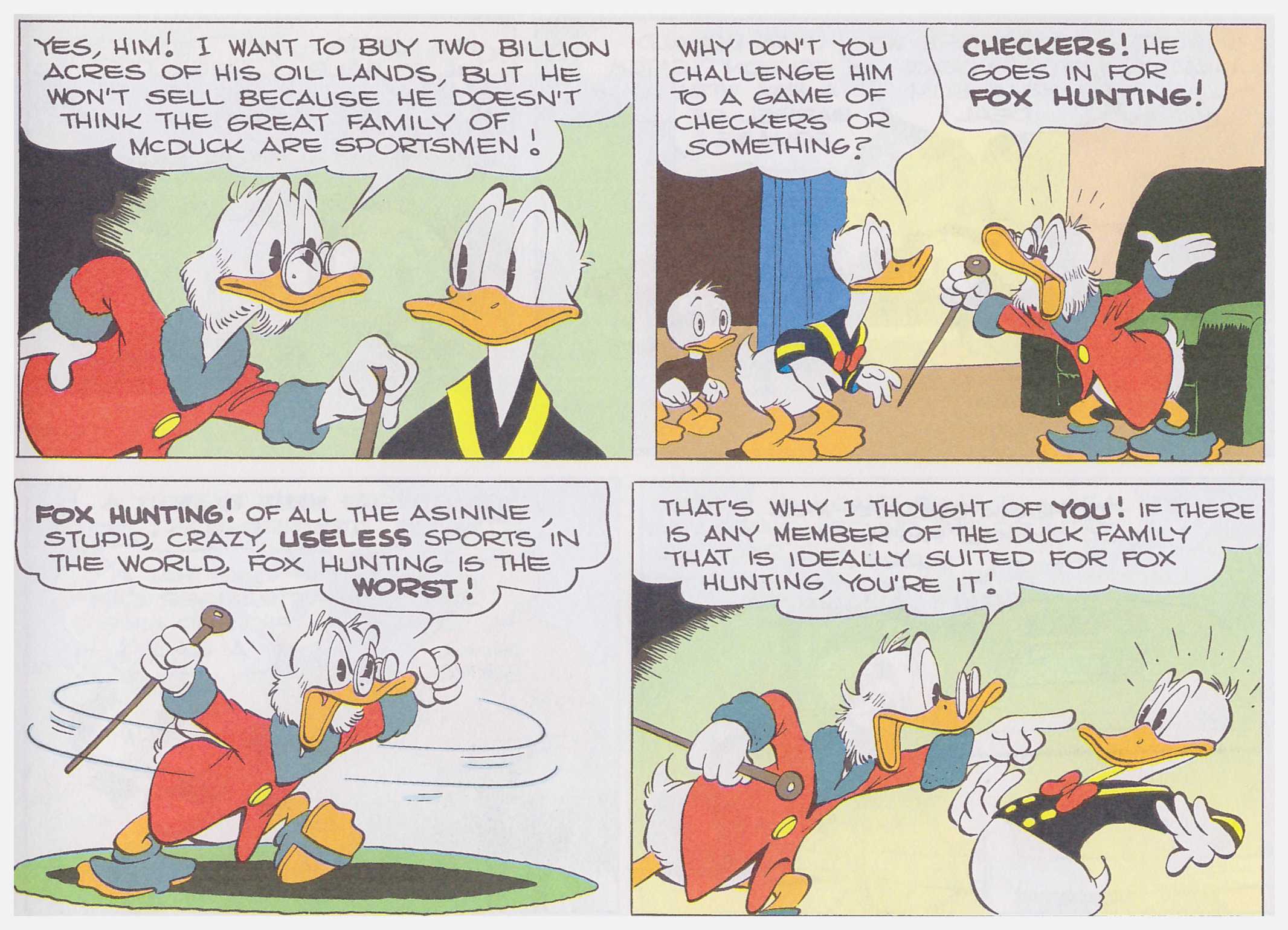
But to you guys who complain about the modern-day colorings... here's a scan I came across from one of the Carl Barks Library in Color albums. Don't mind the somewhat bleak quality of the scan; look at the coloring itself. Do you really have any problems with these colors? For me, they look better than anything in Fantagraphics' library.
Mesterius Yes, that example you posted looks pretty good. The only thing I dislike is the gradient background in the 4th panel. I can't stress enough how much I dislike unnecessary gradient coloring.
Mesterius Yes, that example you posted looks pretty good. The only thing I dislike is the gradient background in the 4th panel. I can't stress enough how much I dislike unnecessary gradient coloring.
There is a slight touch of gradients in that background, yeah... but it's really, really subtle. I can't understand why that would bother people. The gradients on clothes that I mentioned before in the Scandinavian Volume 1 was 100% more obtrusive.
Still and all, I don't like the colour of the wallpaper changing from yellow-green above the figures, to yellow below them. That difference draws the eyes to it, and away from the action of the story, just as the ridiculous pink and bright red or lavender skies in mid and late 1960s and 1970s Gold Key issues. I started reading Disney Comics at the beginning of the 1950s, and so, I'm used to seeing flat, consistent colours on walls and other backgrounds. I don't think an inside wall would end up half one colour and half another. And gradated colours in inside scenes don't usually fit with the artist's implied light sources. And when that happens the scene can be even more unrealistic, and drawing the reader's eyes away from continuing to read and "live" inside the story. So, I'd rather have flat colours, especially on indoor scenes. I always hated having giant mountains in the background have one solid colour. But, I'm not sure that most Disney Comics colourists would make those outdoor scenes realistic with gradation, in any case. I really doubt that Disney Comics colourists would take into account the time of day and which side of the scene would contain the major light source, and where shadows would be in the distance in each and every one of a story's panels, or even just in a few important key panels, for that matter. So, maybe it would be better to just have flat, consistent colour for each line-sealed area.
There is a slight touch of gradients in that background, yeah... but it's really, really subtle. I can't understand why that would bother people. The gradients on clothes that I mentioned before in the Scandinavian Volume 1 was 100% more obtrusive.
Still and all, I don't like the colour of the wallpaper changing from yellow-green above the figures, to yellow below them. That difference draws the eyes to it, and away from the action of the story, just as the ridiculous pink and bright red or lavender skies in mid and late 1960s and 1970s Gold Key issues. I started reading Disney Comics at the beginning of the 1950s, and so, I'm used to seeing flat, consistent colours on walls and other backgrounds. I don't think an inside wall would end up half one colour and half another.
But Western Publishing comic books of the 50s have PLENTY of instances where the walls change colors to extreme degrees, much more strikingly than here. That was not the case with Dutch Disney comics of the era?
Yes! In the '60, especially the mid-to-late 60s, Donal Duckm Weekblad pages were coloured TERRIBLY! Yes, colours of the same objects or things in the backgrounds changed from panel to panel. I hated that just as much as Gold Key's colouring. I don't remember that too much in the 1950s US/Canadian Disney Comics. That sort of thing was only used in a few key panels per story back in the 1950s, ostensibly to draw the eye and change that panel in importance from its surrounding panels..
Hmm. Really, though? Here's the same half-page with the first-generation Western Publishing colors, from Walt Disney's Comics and Stories #98 (1948)...
...and below is the following half-page. The livingroom wall abruptly changes color from yellow to blue for no discernible reason. This happens a LOT in Western's 40s and 50s comic books (I've read enough Fantagraphics volumes faithfully recreating those colors to know). Not to mention, I find those spots of blue surrounding Scrooge and Donald in the above panel 4 much more distracting than the use of gradients in the CBLiC.
I took David's post to mean that Hamilton reinked it himself.
That wasn't my intent. Reinkers at the Hamilton company could be one of several staffers, and I'm not sure who did it in this case.
Some partially, or entirely reinked material originating in the Hamilton CBL includes:
- W CP 1-01 Letter to Santa (page 1 only)
- W KGA 2-01 Donald Duck Tells About Kites (at least part of all pages)
- W WDC 87-02 The Terrible Turkey (pages 3, 5, 6 only; Inducks says reinked by Jippes but it's actually a non-Jippes reink) Fantagraphics version substitutes a Dutch line art source that I accessed and believed was original, though it could possibly be a Barks/Jippes combination. (It's good enough that I'm actually unsure.)
- W WDC 240-01 The Fraidy Falcon (page 3 only)
- W WDC 242-01 Balloonatics (page 7 only) Fixed at Fantagraphics
"Too Many Pets" and "The Hard Loser" were both reproduced—in whole or in part—from color sources in the CBL, and had some retouching done to get rid of the color; but the majority of the linework does appear to be Barks' own. I believe (though I'm not 100% sure!) that every post-1983 printing of these two stories was made from the CBL version.
With all the squabbling about coloring, I begin to see why Another Rainbow Publishing decided to print their Carl Barks Library in black and white…
And that also explains why Another Rainbow/Gladstone printed an entirely new library IN COLOR one decade after their black-and-white library?
The intention behind AR's original Library feels obvious: It was the first time Barks' work was collected, so they wanted to do an edition which showed his original artwork exactly as he drew it. I would guess economics of printing played into it too.
But honestly, I don't think there was that much "squabbling" about the modern-day coloring by Gladstone before Egmont's Scandinavian Carl Barks Library.